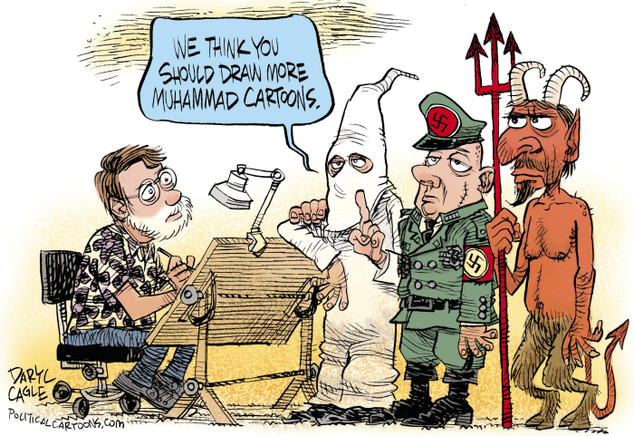
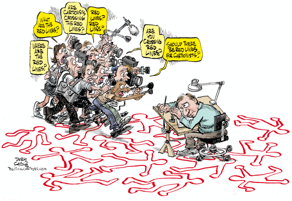
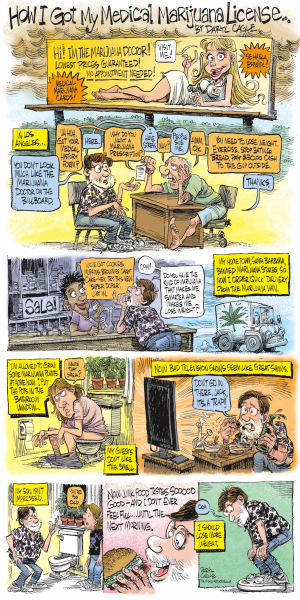
I get occasional requests from readers to explain the nuts and bolts of how I draw my cartoons, and to show my rough sketches. Here are three examples.
First I do a rough sketch in hard pencil on 11" by 17" paper. I like the extra hard pencils because they encourge me not to spend too much time on the rough – the hard pencil keeps me from rendering, which I tend to want to do. If I don’t like how a sketch is going, I’ll throw it out and start a new one, rather than trying to repair the sketch. These are pretty fast.

Then I draw the finished line art by tracing over the rough. I use Duralene paper, which is a plastic drafting vellum that has a way of gripping the pencil that I find pleasing. I do my finished line art with either a hard #5 pencil if I’m feeling too loose, or a yellow #2 office pencil if I’m feeling too stiff.

Most newspapers run the black and white artwork. I usually don’t like the look of tone in my cartoons, so I’ll do cross hatching and blacks to give the lines some substance on the page. This drawing is the same 11" by 17" size.
Here’s another rough. It is the same thing, hard pencil on tabloid size paper.

Then I trace it in pencil on drafting vellum, adding cross hatching tones and blacks.

And I’ll usually color the cartoon in Photoshop, depending on how much time I have. Only a few newspapers run color on their Op-Ed pages, but color is nice on the web site.

Here’s another one. I’m including this one because the rough is a little messier.

This one is about as complex as I like to get in a cartoon. I think cartoons are stronger with only one or two big characters filling the space. Cartoons are better with fewer words too, and this cartoon is a little weak, but it made a point that I haven’t seen made in other cartoons so I went with it. Here it is below, in pencil on the drafting vellum, with some hatching for tone to give it some substance on the page, as most readers will see it.

And here it is with some quick Photoshop color.

I usually try to use light, pastel colors, because that is what editors ask for. The light pastels look best in lousy newspaper printing where colors tend to muddy up and darken. Earth tones are always a gamble in newspapers; there is no way of knowing if a brown will lean to red or to blue. Unfortunately, the light, pastel, compromise newspaper colors tend to look a bit unsophiscated on the web – I regret that, but I don’t have a good solution for it.


