Categories
Blog Newsletter Syndicate

The Great Mort Drucker Passes Away

I was saddened to learn this morning that cartooning legend, Mort Drucker has passed away at 91.

I grew up loving Mort’s brilliant artwork in Mad Magazine and he was a great influence on my own work. I think Mort was the greatest caricature artist ever. Mort drew the best and most memorable Mad Magazine movie and tv parodies.

I got to know Mort through the National Cartoonists Society. Other cartoonists would trail after him and ask him to draw their portrait, to which Mort would always respond to draw the backs of their heads –that was easier, and quick, and it looked just like them. Mort was a gentleman. I also like that he called everyone “darling.”

Mort was a staple in advertising and magazines, not just in Mad Magazine. He drew tons of magazine covers, advertising and movie posters, including the iconic poster for American Graffiti. I loved his work in black and white, but his color was fantastic. Mort painted over his ink linework with Dr. Martin’s Dyes, a difficult medium that I could never wrap my head around, but it made his colors glow.

Here’s a nice 13 year old post from my friend, Tom Richmond, who followed Mort,  filling his big shoes doing movie parodies for Mad.


Here’s a nice obit from famed comics writer and personality, Mark Evanier.


This piece from Lambiek Encyclopedia gives a nice overview of Mort’s career.


The video below comes from the National Cartoonists Society. It shows Mort interviewed by John Reiner (a great guy who is a brilliant caricature artist himself).


This piece is the front cover of Mort’s book, “Mad About the Movies” …


A fond memory of Mort who drew many Star Wars parodies …


Mort did lots of advertising work. The odd map (below), of how to get to the Mortgage Bankers Association convention in Atlantic City, was a strange journey for me. The ad agency had hired Mort Drucker to do it, and Mort quit after doing the sketch. The job paid pretty well, and Mort’s sketch was nice, so I gave him a call and asked, “What’s up with this job?” I paraphrase from my 30 year old memory – Mort told me this was a job from hell, and the art directors had so many changes he couldn’t stand it any more.” I asked if he minded that I take the job and work from his sketch, and Mort was fine with that, as long as he never had to hear from those art directors again. So I rendered this brochure artwork from Mort’s lovely, rough sketch. And the art directors from hell didn’t give me any trouble – I think Mort wore them down before I stepped in.

If I was an art director, I would never think of asking Mort Drucker to make changes.

Twenty years later, in 2008, the mortgage bankers would destroy the economy – oh! The irony!


Mort is my hero. He taught a generation how to draw. His inspiration lives on.

Photo from the National Cartoonists Society – and probably from my buddy, photographer Greg Preston.
Categories
Blog Newsletter Syndicate

Where do you get your ideas?

Here’s a nice piece from my brilliant buddy, Bob Englehart. Support Bob on Patreon


The question I’m asked most often is, “Where do you get your ideas?” It’s a simple question with a complicated answer. The questioner is not asking what information I’ve found, or the source of the news I based the idea on. The questioner wants to know how my brain works, what my imagination conceives and how, out of the jumble of thoughts, one comes forth and plunks me in the head. I sometimes would answer, “From the Editorial Cartoon Idea Company in Teaneck, New Jersey.”

Since the beginning back in Chicago, an idea just comes to me, most times several. I don’t exactly know how it happens. The trick is to recognize it; the good one from the lame one, to know which one would make an outstanding cartoon. I’ve looked at plenty of editorial cartoons over the years and learned how to deconstruct them. In the end though, it’s about making choices. If I’m going for a funny cartoon, I want one that makes me laugh. After all, I’m the first reader. If someone has died and I’m sad, I want a cartoon that reflects my sadness, or my appreciation of the life the deceased led. If I’m pissed, I want a cartoon that demonstrates it. Whatever my feelings, I want to share it with the world because I know I’m not alone in whatever I’m feeling. I think that’s one of the very important things a cartoon, any cartoon, does. It shows us we are not alone in our feelings.

It starts with the quick little drawing called a “gag.”

My ideas emerge because they seem logical and obvious. So often I think that someone must’ve already drawn that idea, or maybe it was drawn dozens of years ago and I conjured it up from the dark web of my memory. I finally realized it’s only obvious to me. That’s the cool thing about being an individual in a sea of humanity. There are only about 25 full-time editorial cartoonists employed by a newspaper in America, but if you go to the Internet and look, there are thousands, most of them amateurish and tedious with no sense of timing, drawing talent or sense of humor. But each cartoonist is doing their best to share their opinion.

The next step is to make a tracing of what the finished art will look like.

So, a better question is, “How do you develop your ideas?” This, I can answer, or rather, I can show you.

It starts with the quick little drawing called a “gag.”  The name doesn’t mean it’s necessarily funny. Stuntmen and women call the stunt they’re going to perform a gag also. I jot it down because it’s easy to forget the purity of the original idea and the perfect wording. I usually write it in a reporter’s notebook, but I’ve written them on restaurant napkins. I also carry a small notebook in my back pocket.

Then I draw the cartoon in black line on glossy copy paper.

The next step is to make a tracing of what the finished art will look like.  I fix spellings as I go, work on the likeness of my caricature, maybe change the layout, erase, maybe flip the whole thing, erase again, whatever I think it needs. This is the “blueprint” for the drawing.

Then I draw the cartoon in black line on glossy copy paper. I most often use Micron markers, but now and then, I use Zig Cartoonist black ink and a flexible crow quill nib. Hey, if pen and ink was good enough for Leonardo DaVinci, it’s good enough for me. I scan the line art into my computer using Photoshop, add color, change the composition here and there, fix more spellings (I’m the world’s worst speller, particularly with names) and tinker with it till it looks right to me. The finish is in a digital format that I send to Caglecartoons.com ready for publication, except when they call or email me that I’ve misspelled another word, a word I was confident I knew how to spell and didn’t bother to check.  (As happened with this cartoon, after we sent it out to newspapers, and we had to issue a correction. Arrrgh! –Daryl)

So, that’s the process. I still don’t know exactly where I get my ideas but I know how to make them into a cartoon.


Bob Englehart, E-mail Bob

Support Bob on Patreon

Read Bob’s Other Post:

The Birth of a Political Cartoonist

Categories
Blog Columns

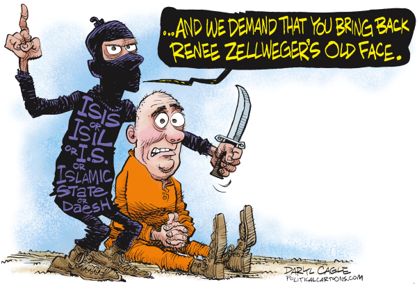
The Real Experts on Renee Zellweger’s New Face


The media has been obsessed this week with Renee Zellweger’s new face, with articles quoting plastic surgeons on why she doesn’t look like herself. Zellweger says she looks different because she’s happy now and doesn’t admit to having plastic surgery.

Most plastic surgeons are quoted saying Zellweger has had work done, agreeing that she had her eyelids “opened” and disagreeing about other possible surgery, like cheek or chin implants. Some pundits complain that the media obsession with her new face is sexist, that no one would care about changes like this if she were a man, and the emphasis on her face is hurtful to her and shows society’s priorities are in the wrong place.

The real experts on faces are cartoonists. Plastic surgeons can change flesh and bone, but cartoonists must know how to make someone really look like themselves. Cartoonists come face to face with America’s sexist realities every day. Caricature artists learn this right away when they draw couples together. We can exaggerate a man’s features and his female companion will laugh, say “that looks just like you” Most men will smile, or they will snort, say “OK,” and move on without feeling too insulted. If a cartoonist exaggerates a woman’s notable features, he’s only asking for trouble; both the man and the woman won’t like it. Caricature can be an insulting profession.

The solution is to draw every woman so that she looks like a “Disney Princess.” Ask her something about herself; perhaps she plays tennis; give her a Disney Princess face; keep the hairdo and draw her playing tennis; she’ll love it. Making a man look like a Disney Prince doesn’t work, men have to be drawn so they really look like themselves.

Caricature is a process of identifying interesting, distinctive features on a face and exaggerating them. Women don’t want exaggerated features. The standard for the most “beautiful” women is that there are no outstanding, distinctive features at all. The most “beautiful” women are the most difficult to caricature, because there is nothing there to exaggerate.

So it is with Renee Zellweger; her old face was the face of a pretty “girl next door”, not a fashion model. She had a chubby, cheeky face with “hooded” eyelids. The new Zellweger face has lost the old eyelids, opening her eyes up to be less distinctive. It looks to me like her nose has been shaved down a tad, to be straighter and a bit less full.

Another big issue in caricaturing women is weight. Most women want to be thin. No matter how slim they look, they will be happier if they are drawn to be thinner. Zellweger looks to have lost a lot of weight; she’s lost her signature chubby cheeks and full lips. The weight loss makes her chin and jaw line more angular.

Renee Zellweger was lovely as a girl next door, and she is still lovely now that she looks like a different person and has the features of a fashion model/Disney Princess. Many women are unhappy, obsessing about how they look, even if they look great already. Women can always be thinner. Every feature can always be less distinctive.

The real problem with Renee Zellweger’s lovely new face is that there was no problem with her lovely old face, and still she wanted to get a new face.

Well … I thought this was funny. Maybe it is too soon.
Categories
Cartoons

Renee Zellweger for Daryl Cagle Column Illustration

155317 600 Renee Zellweger for Daryl Cagle Column Illustration cartoons

Categories
Blog

Is This Obama Cartoon Grotesque and Racist?

John Darkow / Columbia Daily Tribune

As questions grew about the scope and focus of the Obama Administration’s offensive in Libya, Columbia Daily Tribune cartoonist John Darkow drew the cartoon above, suggesting that the “limited target” that Obama spoke off actually included the removal of Libyan leader Moammar Gadhafi.

But Daytona Beach News-Journal reader Martin Press couldn’t get past what he refered to as the “wildly exaggerated features” of President Obama.

“The caricature… is so disrespectful to the president of the United States that it could have been drawn by one of the nutty “birthers” who infest the media,” wrote Press in an letter to the editor.

We’ve had numerous discussions here about the unique difficulties that come into play when your exaggerating features and caricaturing the nation’s first black president. Is Press right about this Darkow cartoon being “grotesque and racist,” or is he just being too sensitive to race and the art of a political cartoonist to exaggerate the features of his subject, in this case President Obama?

Categories
Blog

Taylor Jones at the 2010 NCS Reuben Awards Weekend

Here’s a conversation I had with our brilliant editorial cartoonist, Taylor Jones, at the Reuben Awards last weekend in New Jersey. See more of Taylor’s work in his archive here.

[youtube http://www.youtube.com/watch?v=dNnefKcjxZg&hl=en_US&fs=1&]

Check back throughout the week for more videos from this year’s Reuben Awards.