Here’s a batch of some crazy TRUE stuff from my factual cartoon panel from the 1990’s that never gets old!


Here’s a batch of some crazy TRUE stuff from my factual cartoon panel from the 1990’s that never gets old!


Here’s a new collection of my old TRUE cartoons about devils, angels and yucky stuff!


I’ll be posting more TRUE cartoons soon.
Want to see more collections of my TRUE cartoons? Here are some cool links:
Editorial page editors typically reject anything new and different from editorial cartoonists. Unusual styles and formats are just not what editors want to see. Editors like cartoons that look like what they think editorial cartoons should look like – which leads to lots of cartoons that look much the same.
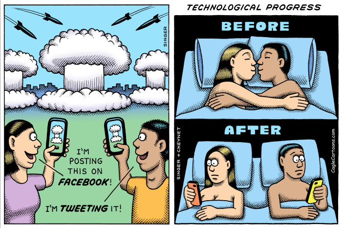
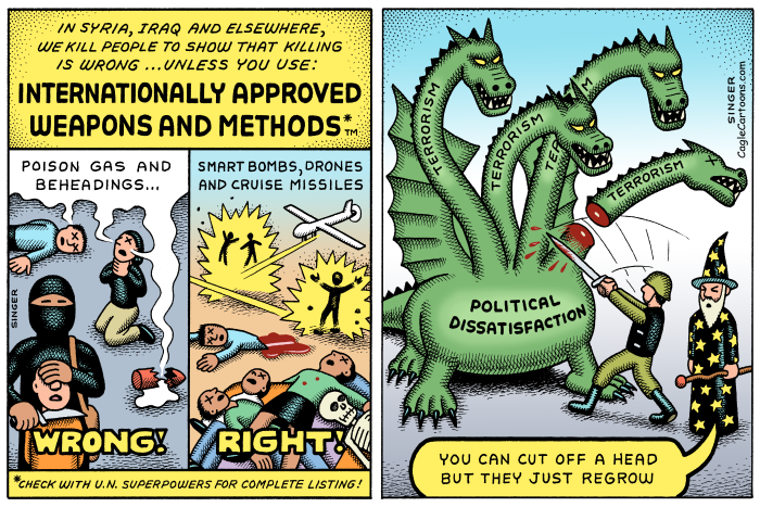
 I’ve been a big fan of Andy Singer’s self-syndicated, altie “No Exit” panel for years, and I’ve been encouraging Andy to try his hand at more traditional editorial cartooning. Andy’s panel has content that is socially conscious, like an editorial cartoon, but it is not the right shape, and it is wordy, and it doesn’t have caricatures of politicians and the panel format with a title is simply not something editorial page editors will consider putting in their daily editorial cartoon hole.
What to do? Andy wanted to be on the editorial pages but was committed to continuing the “No Exit” panel. Then he gave me a new pitch, saying, “Daryl, you know, when I put two of my panels next to each other it becomes the shape of an editorial cartoon, and if I do two panels that are on the same topic, and color them, it looks like one big editorial cartoon.” The idea looked interesting to me. The result is rather stylistically different than what editors are used to but Andy’s new editorial cartoon format looks like wordy, multi panel editorial cartoons, and editors seem to be accepting them. The connection between the two panels might be a stretch, but no one seems to notice. So far, so good.
A number of comic strip cartoonists, Like Dan Piraro and Wiley Miller, have been doing their cartoons in both strip and panel format for years. Andy’s work has some format advantages over most magazine gag cartoonists’ work; Andy’s panels are topically editorial cartoons to start with, and he doesn’t have a classic gag cartoon style with a caption at the bottom, which would be more difficult to reformat. Still, it may be that some other socially conscious panel or gag cartoonists could develop a new market by finding a procedure to reformat their ongoing work as editorial cartoons. Andy Singer is the trailblazer.

Here are a couple more new editorial cartoons from Andy. Follow Andy’s work on Cagle.com here.


Here I sit in my new Nashville, Tennessee apartment, trying out a new restaurant for every meal, and finally drawing cartoons. I finished my second cartoon in Nashville today – a busy, crowd scene cartoon about Obama and foreign aid to Egypt. Here is my rough pencil sketch.

I drew this first with a light, hard, #5 pencil to get the people in the crowd into the right composition, so they are interacting with each other, have expressive body language, their faces aren’t obscured, the feet and arms are on right … all those details need to be thought through for each figure; better to do it in a sketch than on the fly in in finished art. The line art is below. I debated whether to go with just line for the black and white version that most people see in the newspaper.

Here is the gray-scale version. I thought it read a bit better with tone. I do the gray-scale separately. It isn’t just a gray version of the color cartoon.

I usually avoid doing crowd scenes. When I was an illustrator, I used to do a lot of crowd scenes. I think art directors would sit in a brainstorming meeting and come up with a list of too many things that they needed to put in an ad – so they would call a cartoonist to jam it all into one piece of art. Cartoonists get these jobs because the lists are too long, so the art has to be crazy. In fact, crowd scenes are usually not very effective compositions. The most effective compositions show powerful character and expression, which is better done with large figures and faces. With too many little figures in a crowd, the power of the expressions and body language are lost to tiny details. That said, I hate to admit that sometimes a concept calls for a crowd scene.
Here’s the color cartoon …

This one suffers from low resolution on the web, and will look much better in print, with crisp lines and texture in the tiny characters. Here is a detail.
One funny thing about cartoon crowd scenes; when readers send me unsolicited ideas for cartoons, the ideas are almost always for crowd scenes. The reader wants to say so much in his cartoon idea, that he comes up with a list of junk to include, just like the sloppy advertising art directors. Some ideas I get start with, “draw an army on the left, and another army on the right …” or the reader will write, “fill the sky with helicopters …” Not only am I too lazy for this, all the tiny details would be ineffective in the composition, and the cartoon would be lousy. For people who think in words, not images, these list-cartoons make perfect sense; to cartoonists, they are nonsense.
The previous cartoon is another Egypt/Arab Spring drawing. Here’s the rough pencil sketch. Notice that I drew Obama too low and made a note to move him up. I make lots of mistakes. Mistakes are easy to fix. Better to make lots of mistakes and have no fear of mistakes – at least in cartoons. I wouldn’t give that advice to my dentist.
Here is the line art version that most people will see in the newspapers. No gray version for this one. I like to keep them as line art if possible – there is something more elegant about not having to rely on tone.

And here is the color …

This cartoon is similar to one I drew a week earlier, with Obama and the Republicans. I like the yellow ochre texture background for dirty fighting scenes.

Obama doesn’t actually wear pinstripe suits. He wears plain black and blue suits, which are no fun to draw. So I take some artistic license. This recent Detroit-in-the-toilet cartoon also uses the yellow ochre, grungy theme that I’m fond of right now.

Another recent one I neglected to post is this one about the chilly relations with Russia – not much of a cartoon, just an illustration of chilly relations.

Sorry, with the move to Nashville I’ve fallen behind. I’ll catch up soon.
Nashville is starting to grow on me. I’ll get used to it soon – when it cools off and the humidity goes down.
